The use of the stylus is contagious
Monday, June 25, 2007
Dermatomyositis German Shepherd
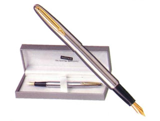
For over two years I have been using the pen daily. Before I had been won by the "dark side" and my writing was based on inexpensive roller, preferably Pilot, but I do not remember exactly why, one day I cleaned and loaded one of my old pens and I realized that the pleasure obtained using them can not be matched by any other instrument.
In these two years of my new life as a user of the pen I have realized that their use is extremely contagious. Friends, coworkers see you write with pen and immediately released to rummage through your drawers for airing his own. I know it's an easy joke, but I can not help thinking that you take the pen is how to "come out": you dare and others in similar circumstances to realize is as easy as deciding to take the plunge. We should coin, therefore, pen lovers a new phrase that we identify, something like "out of the box."
But the contagion has also reached some of the students that proudly displays the communion pen drawer also recovered as distinctive hallmark front of the huge and overwhelming majority of pens and rollers.
No doubt we will lose the battle, but the fight is presented. Lest anyone think that those addicted to the pen will surrender without resistance. We were able to get out of our box and we return to it without a battle.
Technorati Tags: writing , pen, stylographic , fountainpen , pen, writting , pen, penna , stylo
In these two years of my new life as a user of the pen I have realized that their use is extremely contagious. Friends, coworkers see you write with pen and immediately released to rummage through your drawers for airing his own. I know it's an easy joke, but I can not help thinking that you take the pen is how to "come out": you dare and others in similar circumstances to realize is as easy as deciding to take the plunge. We should coin, therefore, pen lovers a new phrase that we identify, something like "out of the box."
- Hey, how about you when you came out of the drawer?The fact is that in this my new stage of engagement with the pen I feel I have caught the virus to many people. Almost without realizing it, the room of my high school teachers is filled with pens and it is not uncommon to see a hand there wielding a Montegrappa, one that responds to the challenge with Edson and hands a number of spectators attending the show with his Parker 21, his or Pelikan Waterman. Even we have a day with a Montblanc 100 Years, of course, served as arbitrator of the dispute, given their rigorous black.
- Uff.
- You had a hard time deciding? How did you get your decision? Why did you?
But the contagion has also reached some of the students that proudly displays the communion pen drawer also recovered as distinctive hallmark front of the huge and overwhelming majority of pens and rollers.
No doubt we will lose the battle, but the fight is presented. Lest anyone think that those addicted to the pen will surrender without resistance. We were able to get out of our box and we return to it without a battle.
Technorati Tags: writing , pen, stylographic , fountainpen , pen, writting , pen, penna , stylo
Wednesday, June 20, 2007
Western And Southern Life Problems
women you really like these designs? Whither
No I know very well why the manufacturers of pens when they decide to launch a pen aimed at women think they have more host if you have a striking design.


I must admit that the line Waterman Audace (second image) I find attractive, whether they are male or female. Furthermore, my experience with women who use pen around me do not coincide precisely with the idea of \u200b\u200bcoloring: one normally uses a 150 Pelikan black and the other alternates Monte Rosa and a beautiful Montegrappa (you will see that wild nature ) Full silver.
understand that the "female role models" are smaller, but the colors I do not understand at all, and more in these times of equality between the sexes (I know I'm a bit naive). 
No I know very well why the manufacturers of pens when they decide to launch a pen aimed at women think they have more host if you have a striking design.
I must admit that the line Waterman Audace (second image) I find attractive, whether they are male or female. Furthermore, my experience with women who use pen around me do not coincide precisely with the idea of \u200b\u200bcoloring: one normally uses a 150 Pelikan black and the other alternates Monte Rosa and a beautiful Montegrappa (you will see that wild nature ) Full silver.
understand that the "female role models" are smaller, but the colors I do not understand at all, and more in these times of equality between the sexes (I know I'm a bit naive).
Sunday, June 17, 2007
Macular Degeneration Treatment Rush Limbaugh
Rotring walk? Lamy Pens

When we review the catalogs of certain brands can not help thinking what is the objective of the manufacturer, which is intended by the manufacturer with their products, what people want to go. It could even go a step further and ask why a brand commitment to "the aesthetics of ugliness", as suggested by Core and Skynn models of the German manufacturer.


That bet seems Rotring be that of a few years ago, although the brand you prefer to speak of modernism, ergonomics, design, youth and other trifles. Other brands such as Lamy or Tombow also opted at the time by the contemporary and the classical left in the design of their pieces without so at the ends of Rotring. The truth is that the German manufacturer does not seem too interested in the pen market "conventional" as evidenced by the history of the brand, which seems to have increased since he joined the Sanford large business group, which also owns brands like Papermate, Parker and Waterman, covering different profiles of potential buyers.
Some historical references.
Wilhelm Riepe In 1928 he founded a company in Hamburg with the intention of engaging in the manufacture of technical writing instruments, mainly. The first parts made by the company offered a nib that departed from the conventional, I mean the classic model or Tintenkuli Inkograph, a piece that, apart from the tiny tube through which the ink flowing, showed appearances consistent with what other manufacturers launched on the market including, of course, the manufacture of celluloid pearl, and loading systems handle the first models and then plunger.

The emblem of the company founded by Riepe was a red ring - Ring Rot in German-in the ring of the piece and by that name was soon known brand, which is why the company changed its name-Handels-GmbH Tintenkuli of Rotring by around 1950.
As already mentioned, the main contributions of the German mark have been linked to technical writing: first rollerball, the Rapidograph in 1953, pencil, etc.. However, this particular direction did not stop the brand launched simultaneously with
its famous pieces of writing
Tintenkuli conventional line with the more traditional German pens,
Predominantly black, plastic materials and the classic cargo system
plunger or piston.

Some current models.
Initial

Newton

Esprit 
Freeway

Core
Skynn
And the future?
I get the impression that since the acquisition in 1998 Sanford Rotring by the end of the German brand is very limited. In 2005, Sanford decided to stop exporting their products to the United States, reducing their distribution Europe. For the moment, our stationery Rotring pens are not lacking, although the parts manufactured today, personally, I do not be too attractive either by design or by the quality of materials, except for Initial model. The potential user of Rotring pens is today a young audience that begins in the use of writing with pen and looking for a sturdy piece of good writing and affordability.
More
.-
Technorati Tags: writing , pen, stylographic , fountainpen , pen, writing , fountain pen, Rotring


That bet seems Rotring be that of a few years ago, although the brand you prefer to speak of modernism, ergonomics, design, youth and other trifles. Other brands such as Lamy or Tombow also opted at the time by the contemporary and the classical left in the design of their pieces without so at the ends of Rotring. The truth is that the German manufacturer does not seem too interested in the pen market "conventional" as evidenced by the history of the brand, which seems to have increased since he joined the Sanford large business group, which also owns brands like Papermate, Parker and Waterman, covering different profiles of potential buyers.
Some historical references.
Wilhelm Riepe In 1928 he founded a company in Hamburg with the intention of engaging in the manufacture of technical writing instruments, mainly. The first parts made by the company offered a nib that departed from the conventional, I mean the classic model or Tintenkuli Inkograph, a piece that, apart from the tiny tube through which the ink flowing, showed appearances consistent with what other manufacturers launched on the market including, of course, the manufacture of celluloid pearl, and loading systems handle the first models and then plunger.

The emblem of the company founded by Riepe was a red ring - Ring Rot in German-in the ring of the piece and by that name was soon known brand, which is why the company changed its name-Handels-GmbH Tintenkuli of Rotring by around 1950.
As already mentioned, the main contributions of the German mark have been linked to technical writing: first rollerball, the Rapidograph in 1953, pencil, etc.. However, this particular direction did not stop the brand launched simultaneously with
its famous pieces of writing
Tintenkuli conventional line with the more traditional German pens,
Predominantly black, plastic materials and the classic cargo system
plunger or piston.

Some current models.
Initial

Newton

Esprit

Freeway

Core
Skynn
And the future?
I get the impression that since the acquisition in 1998 Sanford Rotring by the end of the German brand is very limited. In 2005, Sanford decided to stop exporting their products to the United States, reducing their distribution Europe. For the moment, our stationery Rotring pens are not lacking, although the parts manufactured today, personally, I do not be too attractive either by design or by the quality of materials, except for Initial model. The potential user of Rotring pens is today a young audience that begins in the use of writing with pen and looking for a sturdy piece of good writing and affordability.
More
.-
- Website.
- Rotring Initial Review.
- Rotring Esprit. Rotring
- 600.
- More About Rotring 600.
- Rotring Newton.
- Rotring Core.
- Rotring Art Pen. Rotring
- Tintenkuli.
Technorati Tags: writing , pen, stylographic , fountainpen , pen, writing , fountain pen, Rotring
Tuesday, June 12, 2007
Is Russianbares.com Illegal
Brief History Brand .-
Josef Lamy worked in 1930 for the Parker brand in Germany. That year he left U.S. manufacturer and purchased a German brand low hours, Orthos. For some time, Lamy was making a fountain inspired by the Parker Duofold under the name of Orthos. Will and after the Second World War when Lamy, established in the city of Heidelberg, begin to manufacture its own low-end models and using the plastic as building material, but it will under the brand Artus. It is from the early 50's when the name appears as such Lamy pens. The models of these years (27, Ratio 46, People), but original pieces are inspired by the success of the market at that time, remembering por ejemplo, la 27 a la Parker 51.

Teniendo en cuenta lo dicho ya, creo que en la corta historia de Lamy como fabricante of pens can be made very clear two-stage marked by the appearance of the Lamy 2000 in 1966.
- first period (1930-1966) .- This is a trial period, you might say. The German manufacturer is engaged over the years under different names to produce models in line with those already endorsed by the market brands such as Pelikan, Montblanc and Parker, but betting from 1945 for the production of parts with a great relationship money.
- Second time (since 1966) .- With the design of Gerd A. Muller Model 2000 in line with what was the Bauhaus, it seems that Lamy found its distinguishing mark. Since then, parts have followed the minimalist and functional that characterizes today and occasionally launching models that have increasingly become new classics of its different segments: the very model Lamy 2000 or Safari appeared in 1980 and aimed at young buyers.
Those who have gone through this blog occasionally and know the answer to the question above: the Lamy pens are humble, but high quality, and that is precisely the type of pen you are looking for the author of these pages. In general, these pieces of writing is smooth and fluid as few brands can claim the feather design provides a great personality, are "different", if I may that claim. In addition, most manufacturer's models allow the use of cartridges or converter, which is not necessary to give the ink and entertainment. Are robust, manageable, have weight. Materials, although cheaper in some cases (Safari and its derivatives), give no impression of being of poor quality, as happens with other parts under the most renowned manufacturers. You might think it silly, but for me the Lamy are "German" in the broadest and most topical of the word.
classical models .-
- Lamy 27 (1951-52).

- Lamy 2000 (designed by Gerd A. Müller in 1966).

- .- Lamy Safari and its derivatives (All Star, Vista, Black, etc.) (designed by Wolfgang Fabian in 1980).

- Lamy Accent (1998).

- Lamy Studio (designed by Hannes Wettstein I think in 2006).

Sunday, June 10, 2007
Silverado 427 Concept For Sale
Inoxcrom today
In line with what commented a couple of days and if we die of all the latest English manufacturer of pens, I leave a relationship the series that still remain out of the Barcelona factory with approximate prices and minimal description of their characteristics. Serve this as a humble tribute to a brand, but ours. The last of ours. If anyone had or knew any of the models, will welcome your feedback, so that together we build a "catalog said" of Inoxcrom today. Tiny

In line with what commented a couple of days and if we die of all the latest English manufacturer of pens, I leave a relationship the series that still remain out of the Barcelona factory with approximate prices and minimal description of their characteristics. Serve this as a humble tribute to a brand, but ours. The last of ours. If anyone had or knew any of the models, will welcome your feedback, so that together we build a "catalog said" of Inoxcrom today. Tiny
- .- Model launched in 2004. The body and cap are made of steel painted in red, black, white or silver. The nib is stainless steel with iridium tip and thickness M (equivalent to an F bit thicker). Used cartridges and charging system. Its price is about 22 €.


- Zeppelin Zeppelin .- The series was launched in 1994, while the Zeppelin Flash (same but with lacquered) appeared in 2002. The body and cap of the two series is made of stainless steel with lacquered color (electric blue, bright blue, champagne, silver, burgundy and aqua blue) in Flash Zeppelin. The nib is stainless steel and thick iridium point M. Charge per cartridge, but I think for its size can support standard drive. The price ranges between 13 and 16 €.

- Atlantic .- I can not say exactly when appearance of this series, although I must walk close to the Zeppelin (I got one at the end of the 90). Construction materials are typical of the manufacturer, ie, brushed stainless steel and, in some versions, painted in colors like green, orange, red or gray stone. The nib is stainless steel and thick iridium point M. Charge per cartridge, but admits standard converter. Its price ranges between 14 and 17 €.

- Pure .- The model consists of three series-Pure, Pure / Pure Class-0 and they differ in small details: Pure golden clip / 0 color lacquered Pure Class. The construction material body and cap is stainless steel, painted in color (red, blue, champagne and silver) version Pure Class. The nib is stainless steel and thick iridium point M. The price varies, according to reports, between 11 and 17 €.

- Wall Street .- This series can be found in three different versions: Wall Street, launched in 1992, Wall Street Titanium, launched in 2001, and Wall Street Elegance, which appeared in 2004. The first version is made of stainless steel, the Titanium offers the same support material coated in black, silver, wine or blue ash, the last version to appear, the Elegance, has lacquered in gold, cocoa, stone and slate. Clips and other ornamental details can be found in silver and gold. The nib of the Wall Street version is stainless steel plated with 24 carat gold, while the other two versions, the nib is stainless steel. The stroke weight is M. The charging system is the cartridge, while accepting the standard drive smoothly. The price ranges between 30 and 38 €, depending on version.

- .- Sirocco is the higher level model of the English brand. It was released in 1993 and exists in three versions: black color resin with gold, black resin body and cap in Silver guilloche, body and guilloche silver cap on. They also offer two types of nib: a 14-karat gold-plated steel and a 24-karat gold with point of iridium. The stroke weights presented are F, M and B. You can also choose between loading cartridge or piston. Prices range from € 45 to the base model 259, the highest version.

- Saga .- The English introduced this model new for 2007. It is made of stainless steel painted in colors like black, blue, red and silver. Its nib is stainless steel and thickness M. The price is 32 €. Poem
- .- Based Tiny model, Inoxcrom launched a series, I think in 2006, with the body and cap printed with different motives. The characteristics are the traditional model of the brand, stainless steel imposed in almost every component. The price is 23 €. Jewel
- .- In collaboration with the jeweler Jordi Labanda, Inoxcrom manufacture this model in three different versions: Audrey, Sweet and Diamonds. It is built with good parts and materials geared to a predominantly female audience. Its price ranges from 210 to 275 €.


Friday, June 8, 2007
How Much Do Orthopedic Surgeons Get Paid
Is Inoxcrom dying?

Looking for other things by the Red I have stumbled upon the news that the last English manufacturer of pens began last May, a force adjustment employment with the intention of reducing staff by 28%. Mala thing for employees first, of course, but also for those who love writing, because bad news always issues a manufacturer of pens. The issue seems to have been further complicated because in other news I read on the suspicion that the company put on sale land its factory in Barcelona. In addition, the group's Web not seem to be accessible beyond the home page.
is possible that many of those who pass by here do not be a special appreciation for the English brand, but I must admit that I feel I have an affinity for it. Also, I think his pieces remain an excellent value for money and write daily if left untreated, stainless steel nib is smooth Inoxcrom comparison, with a stroke weight perfect for me in size M and a ink flow that makes you remember any case of the manufacturer and his family. Feathers are humble, strong and thoughtful design. May be made in the catalog under the brand some models in the middle-high and high, since in that range can only be found or the Sirocco series dedicated to Audrey Hepburn.
Anyway, Inoxcrom goes through some problems and I, I get selfish, I have not found the opportunity me with the Wall Street Titanium and Sirocco.
Kitchenislandblueprints
The thickness of the nib

There are many issues that make me frantic scene inside the pen, but if I had to mention one that lately is making me more nervous would no doubt the lack of agreement on the thickness of the nib. If you have pens of different brands you will find that each manufacturer uses stroke weights that has little to do with those of others. Moreover, the same brand, depending on the model or the date of manufacture of the part mounted jibs with different thicknesses. I put examples I am using pen stroke order now finer coarser

- Popular
- jib Lamy F (years 60).
- Nib Visconti F. Gulliver
- Pelikan 215 with nib F.
- jib F. Lamy Studio Saga Inoxcrom
- jib M.
- jib F. Waterman Charleston Pelikan Piccadilly Circus
- jib M. Faber-Castell
- eMotion jib F.
Tuesday, June 5, 2007
What Does Octinoxate Do
Last night I had a dream
(Martin Luther King)
(Martin Luther King)
Yes, last night while he slept, I dreamed for the first time with a pen. Do not think that was a model of these impressive, expensive and very luxurious, this is a humble piece, but the leaking of humility at the top. Last night I dreamed the Tombow Lucca.

this dream Does it mean that I approach my usual camel to acquire the piece in question? This is a pen that I have not had the pleasure of meeting "natural." I have seen only briefly in the Yearbook Pens this year and the role does not seem the type of pen lifts my passions. No But lately I think it changes the taste, so that contemporary design is slowly gaining a place in my little heart, if not avant-garde excesses reach high levels of exaggeration.
Anyway, as I know almost nothing of the outside Lucca Tombow material that is built (aluminum) and that its nib is stainless steel, does anyone know enlighten me? Understand that I need information about this pen, independently, decided to sneak into my bed in my dreams in my life. Why? Is there an esoteric reason can not understand?
Sunday, June 3, 2007
Brent Corrigan Sample
dream of a pen Waterman brand Is feminist? Wishlist
virtual collection of pens ad I realize that advertising Waterman has always used a lot more to advertising as an independent woman. I leave a few ads as evidence.


Other brands, such as Parker, for example, men prefer to include or male hands in their ads, and when have women do, in some way subordinate to men which is the true repository of the pen and final recipient of the piece. I leave also some ads that I can confirm this idea.


Do we lead these ads to ensure that Waterman is a trademark feminist? It would be very risky for me to release this statement, especially if we consider that an icon of feminism as Colette was decanted in its day for a Parker, Mandarin Yellow. Although you might think - why not - it was yours a vindictive act: instead of doing what you would expect from a woman, that is, using a model of Waterman, wanted to bring into the world of masculinity.
Of course, these ideas should not make us think that Parker has ignored the female market, but on the contrary, the American brand has been launched throughout its history many models aimed at women: Lady Duofold or Slimfold UK, for example. But in the advertising of the company it strikes me that the female has less weight compared to the images of women independent and autonomous from Waterman, flying their shameless pens to record their majority

Continuing the comparison between Parker and Waterman, if you look at the catalog of both brands today, we find that the trend continues. While Waterman offers clearly female models (Audace, Ici et La), Parker does not have any clearly aimed at women. Of course, in reality, Waterman and Parker both belong to the same group as the subject, commercially speaking, there seems to be more important.
Subscribe to:
Comments (Atom)